
Type of Business
Yoga Studio
Location
Mexico City
Type of Service
Holistic Branding Journey
Year
2021
The Challenge
Founded by Jorge Espinosa, one of the pioneers of Mexico City's yoga movement, Kiai was created to share the benefits and deep wisdom of yoga in a professional and safe space. As the brand evolved over the years, its visual identity and tone of voice no longer reflected its true essence. The previous branding featured the Anahata symbol enclosed in a plain circle, combined with a color palette of green, orange, and yellow. The overall tone felt too playful, youthful, and carefree, which no longer matched the brand’s growing maturity and depth. While meaningful at the time, it no longer captured the authenticity, wisdom, and evolution of the project. The challenge was to redesign the brand in a way that preserved recognition while aligning every element from visuals to messaging with its unique core, values, and purpose.
The Solution
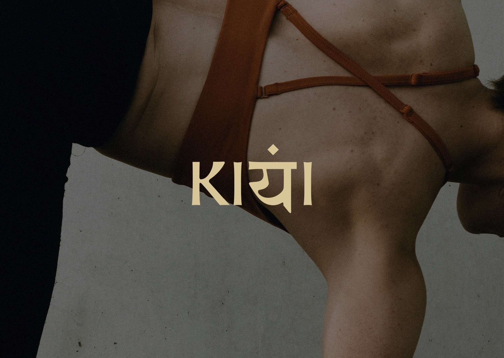
The solution began by aligning the client internally with the true look, feel, and tone of voice of the brand. Drawing inspiration from Jorge’s unique method, which blends yoga with elements of karate, we created a custom typographic logo influenced by sanskrit and Japanese aesthetics. We retained the previous brand’s main symbol, the Anahata, integrating it into the logotype to maintain recognition, while reimagining it through a more refined and intentional lens. We developed two variations: one with a clean, readable composition for everyday use, and another with a more abstract, expressive layout that evokes a symbolic and artistic presence. A circular mark with two petals was also introduced to echo the symbolism of the chakras, visually balancing the energies of yoga and martial arts.


The brand’s tone of voice, visual language, graphic elements, and color palette were all elevated to convey a sense of ancient wisdom, warmth, and grounded elegance. Kiai is an experienced and respected yoga space, and the new identity was designed to reflect that depth with clarity and strength.

As part of the rebranding process, I crafted a complete Instagram profile strategy to align Kiai’s digital presence with its renewed identity. This included defining the username, profile name, bio copy, highlight categories and icon design for highlights.


I also provided visual direction for the feed’s aesthetic, along with guidance on imagery style and usage to ensure consistency and alignment with the brand’s essence across social media. To support future content creation, I designed a set of simple and versatile templates for Instagram posts.

This rebranding journey was a beautiful collaboration rooted in clarity, intention, and depth. By honoring Kiai’s essence and Jorge’s unique path, we brought new life to the brand while staying true to its origins. The result is a timeless brand, with a visual and strategic identity that reflects the wisdom behind the practice and creates space for continued growth, connection, and purpose.
